Creative color usage plays an invisible yet powerful role in everything we design, write, and create online. Whether you’re designing a logo, building a website, or editing a photo, choosing the right color palette can make the difference between a dull impression and a memorable experience. That’s where a Color Picker Tool becomes your creative companion. It allows you to identify, adjust, and apply colors with precision — making your digital creations look polished, professional, and consistent.
Modern color picker tools go far beyond simple color selection. Many include features like Pick from Image, which helps you extract exact colors from a photo, Gradient Generators for creating smooth transitions between colors, and even Color Contrast Analyzers to ensure accessibility and readability for all users. Whether you’re a designer, developer, marketer, or social media enthusiast, a color picker can save time, improve accuracy, and boost your creative confidence.
Let’s explore 15 creative and practical ways you can use a color picker tool in your daily work, and discover how it can simplify tasks, improve design quality, and help you master the language of color.
Part 1: Everyday Design and Visual Branding
1. Building a Consistent Brand Identity
Every successful brand relies on a recognizable and consistent color scheme. A color picker tool helps you identify and maintain your brand’s color palette across all digital assets. You can extract exact HEX or RGB codes from your logo and reuse them in marketing materials, websites, and social media posts. This consistency reinforces brand recognition and builds trust among your audience.
For example, if your logo uses a specific shade of blue, you can use the color picker to capture that exact color value and ensure it’s used in headers, buttons, and call-to-action elements throughout your website. Maintaining color accuracy also ensures that printed materials match your online presence, creating a unified brand experience both online and offline.
2. Designing Eye-Catching Social Media Posts
Social media visuals are often the first thing potential followers or customers notice. A well-chosen color palette can help your posts stand out in crowded feeds. By using a color picker, you can extract harmonious color schemes from images or brand colors and apply them consistently across templates and banners.
You can also use the Gradient feature to create beautiful color transitions that make backgrounds look more dynamic and modern. A subtle gradient between two brand colors can create a professional, cohesive aesthetic that aligns perfectly with your content strategy. It’s a simple yet powerful way to give your visuals depth without overwhelming your audience.
3. Creating Custom Color Palettes from Images
Ever looked at a stunning photograph and wished you could recreate its mood or aesthetic in your designs? The Pick from Image option in a color picker tool allows you to do exactly that. By uploading an image, you can extract the most prominent colors and build a custom palette inspired by nature, art, architecture, or even your favorite movie scene.
This feature is especially useful for designers looking to capture specific themes — such as tropical tones, vintage hues, or futuristic shades. Once you have the color values, you can easily use them in digital artwork, UI design, or web projects to evoke a similar emotional effect. It’s creativity guided by the harmony of real-world color combinations.
4. Enhancing User Interface (UI) Design
For developers and designers working on websites or applications, color accuracy is essential. A color picker tool allows you to quickly sample colors from mockups or screenshots, ensuring that buttons, icons, and backgrounds use the exact shades needed for consistency. This can significantly speed up UI prototyping and reduce design discrepancies between team members.
Furthermore, tools that include a Color Contrast Analyzer ensure that text and interactive elements meet accessibility standards. You can instantly check whether the foreground and background colors have sufficient contrast to be readable for users with visual impairments — a crucial step in creating inclusive digital experiences.
5. Perfecting Product Photography and E-Commerce Design
In e-commerce, the color of your product images must match the actual item to avoid misleading buyers. A color picker helps ensure accurate representation by identifying the true color tones of your product images. You can compare colors under different lighting conditions and adjust them in editing software to achieve a consistent look across your online catalog.
For example, if you sell clothing, a color picker helps you confirm that the shade of “navy blue” or “rose pink” appears correctly in your promotional banners, product thumbnails, and social media posts. It not only enhances visual accuracy but also builds trust — customers feel more confident purchasing when they know what they’re getting.
Part 2: Creative Expression and Advanced Design Applications
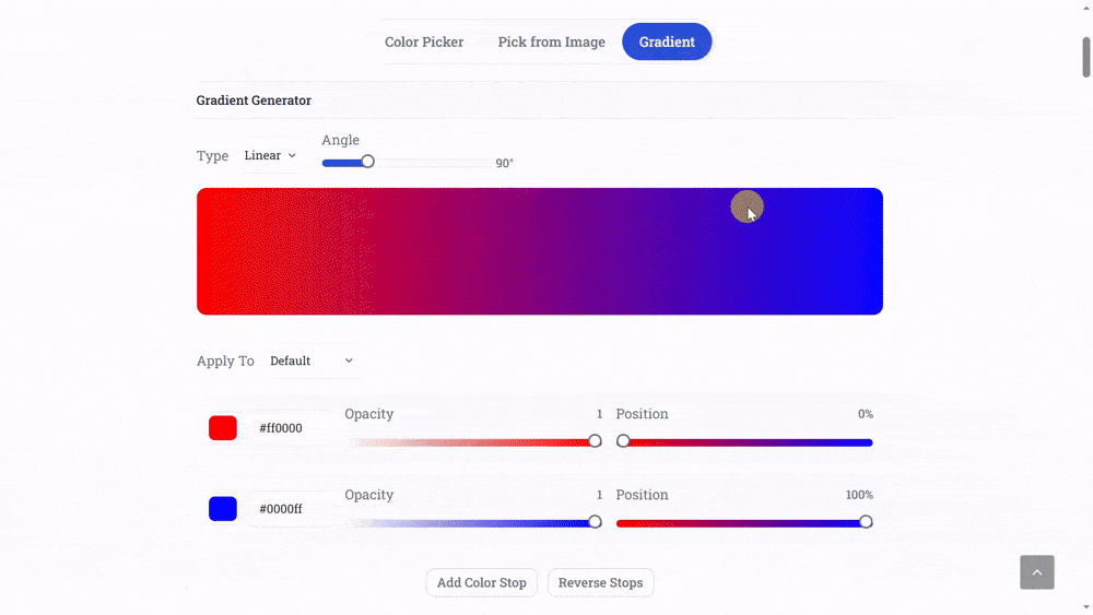
6. Creating Beautiful Gradients for Backgrounds and Buttons
Gradients are among the most popular design trends across modern websites, apps, and digital art. They add a smooth visual flow that gives depth and warmth to otherwise flat designs. With a color picker tool that includes a Gradient Generator, you can create stunning transitions between two or more colors effortlessly.
Instead of relying on pre-made gradients, you can pick colors from your existing brand palette or favorite images and adjust their angles, opacity, or blending modes. For example, a gentle gradient that transitions from pastel pink to sky blue can create a dreamy background for a lifestyle blog, while a deep navy to violet gradient can look sleek on a tech brand’s homepage.
Gradients aren’t limited to backgrounds — they can enhance buttons, icons, and even typography highlights. A color picker lets you control every aspect of these transitions, ensuring both balance and visual appeal. You can preview how they look in light or dark mode, helping you create designs that remain visually stunning across devices.
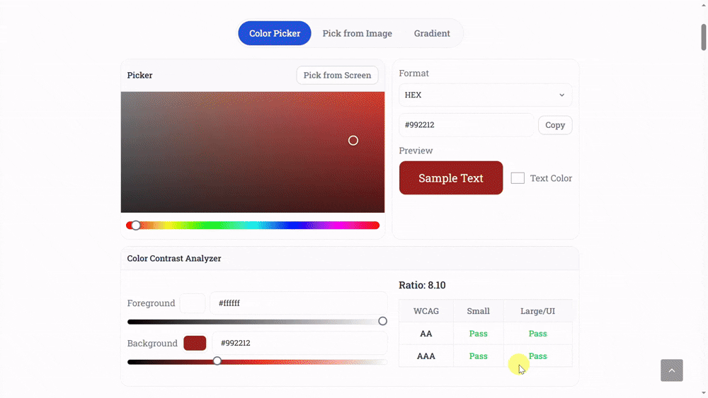
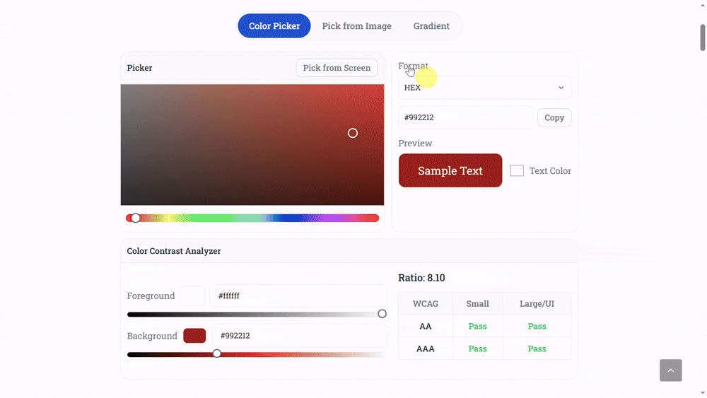
7. Improving Accessibility with a Color Contrast Analyzer
Accessibility in design is no longer optional — it’s essential. When designing websites or digital products, ensuring that all users, including those with visual impairments, can comfortably view your content is a key priority. The Color Contrast Analyzer feature within a color picker tool helps ensure that the foreground and background colors meet accessibility guidelines like WCAG (Web Content Accessibility Guidelines).
This feature calculates the contrast ratio between two colors and alerts you if it doesn’t meet the required standards for readability. For instance, light grey text on a white background might look elegant but could be difficult to read for users with low vision. With the contrast analyzer, you can instantly test and adjust your color choices to create more inclusive and user-friendly designs.
For UI designers, this feature is a lifesaver. It ensures every color you choose not only looks great but is functional, legible, and compliant. Good contrast improves readability, enhances user experience, and demonstrates that you care about accessibility — all of which build trust and credibility in your digital presence.
8. Generating Harmonious Color Schemes
Choosing colors that work well together is one of the hardest parts of design. A color picker tool simplifies this by helping you generate harmonious color schemes automatically. You can use rules based on color theory, such as complementary, analogous, triadic, or monochromatic schemes, to achieve a balanced and visually pleasing combination.
For example, a complementary color scheme (using colors opposite on the color wheel) can make your visuals pop — think blue and orange or red and green. Meanwhile, an analogous palette (colors next to each other) creates a softer, more natural look, perfect for websites or designs aiming for calmness and flow. A color picker with built-in palette generation options takes the guesswork out of finding perfect color matches.
Many creators use this feature to maintain emotional consistency across campaigns — whether they want to communicate excitement, trust, sophistication, or serenity. By experimenting with color harmony, you can transform ordinary visuals into experiences that connect emotionally with your audience.
9. Enhancing Digital Art and Illustration
Digital artists and illustrators often rely on subtle color variations to bring their artwork to life. A color picker tool becomes an essential companion for fine-tuning skin tones, shadows, highlights, and environmental hues. Instead of randomly guessing colors, artists can pick precise shades from reference images or previously used tones for consistency.
For instance, while painting digitally, you might want to reuse the exact skin tone from a previous project or capture a specific shade of sunset for continuity. The color picker makes this process effortless — ensuring visual harmony across multiple illustrations or panels. It also helps maintain the “mood” of a scene by ensuring that all elements share a unified lighting and temperature balance.
Some advanced color pickers also display real-time previews and allow you to compare selected colors side by side. This makes it easier to refine tones without losing track of your creative direction, turning your digital artwork into a professional masterpiece.
10. Designing User-Friendly Infographics
Infographics are a powerful way to communicate complex information visually, but poorly chosen colors can make them confusing or unattractive. A color picker tool helps you create visual hierarchy and clarity through consistent use of shades and contrasts. For instance, using different tones of the same color can highlight related data points while maintaining a clean, cohesive look.
When designing infographics, you can use the Pick from Image feature to draw inspiration from photographs or brand colors. Then, combine it with the contrast analyzer to ensure all text remains readable. By choosing a complementary accent color for icons and data visuals, you make your information both attractive and easy to digest.
Color pickers also help maintain consistency across different infographic templates. Whether you’re designing for education, marketing, or social media, the right color coordination ensures that your visuals look polished and immediately understandable.
Part 3: Marketing, Branding, and Productivity Advantages
11. Designing Consistent Brand Identity
Branding is all about consistency — and color plays the most powerful role in visual identity. Whether you’re designing a logo, website, or social media post, your color palette communicates your brand’s personality and emotional tone. A color picker tool ensures that your brand colors remain consistent across all platforms and campaigns.
With it, you can pick exact hex or RGB values from your logo, store them, and reuse them in future designs. This avoids small but noticeable differences that can make your branding look inconsistent. For instance, a slightly different shade of blue across your logo, website, and email banners can break visual harmony and reduce brand recall. A color picker keeps your hues unified across every medium.
Additionally, color pickers let you test how your chosen palette appears on different backgrounds and devices. You can quickly check whether your brand color looks too bright on mobile or too dark on printed material. Such precision helps you maintain professional-quality branding effortlessly, even without expensive design software.
12. Crafting Social Media Aesthetics and Themes
In the fast-paced world of social media, aesthetics are everything. The most successful brands and creators maintain a consistent visual identity across platforms — from Instagram stories to LinkedIn posts. A color picker tool makes it simple to create unified themes by helping you identify and reuse the same tones in each post.
For example, if your brand’s palette includes coral pink, mint green, and beige, the color picker ensures each content piece uses the same shades without guesswork. This creates visual harmony that your followers instantly recognize. You can even extract colors from past posts or photos to design new visuals that match your existing feed.
Many influencers and marketers also use the tool to fine-tune gradients for text overlays, maintain contrast for quote images, and ensure accessibility compliance. By saving your favorite palettes, you can build a content library that keeps your workflow organized and your visuals consistently appealing.
13. Enhancing Productivity for Designers and Developers
Time is crucial in design and development. Instead of wasting minutes trying to manually match or recreate a color, a color picker tool provides the exact code value in formats like HEX, RGB, HSL, or even CMYK. Developers can copy and paste these values directly into CSS or app interfaces, saving time and avoiding human errors.
For designers, having quick access to all your frequently used colors can significantly boost productivity. You can store and label each tone by project or purpose — for example, “button hover,” “main background,” or “accent tone.” This organization ensures a smoother creative workflow, particularly when working on multiple client projects simultaneously.
When combined with features like contrast checking and gradient generation, the tool becomes a compact yet powerful design assistant. It streamlines repetitive tasks, reduces the need to switch between programs, and helps you deliver high-quality work faster — all while maintaining perfect color accuracy.
14. Exploring Creative Marketing Campaigns with Color Psychology
Colors trigger emotions and influence behavior — that’s the foundation of color psychology. A color picker tool helps marketers use this psychology strategically to build campaigns that resonate with their target audience. For example, blue conveys trust and reliability, making it ideal for finance or tech brands. Red evokes excitement and urgency, often used in sales or clearance campaigns.
With a color picker, you can experiment with different tones to fine-tune emotional responses. You might find that a softer shade of green works better for a wellness campaign than a bright one, or that a muted orange feels more sophisticated than a bold red for lifestyle branding. The tool allows marketers to test and compare these subtle differences before launching campaigns.
Furthermore, you can pick colors from successful competitor ads, analyze their combinations, and create your own unique palette that stands out. The freedom to experiment visually gives your marketing content both individuality and emotional depth — two key factors for audience engagement.
15. Bringing Everyday Creativity to Life
While professional designers use color pickers daily, anyone can benefit from them in creative projects. Students, teachers, DIY enthusiasts, or small business owners can use these tools for presentations, posters, craft designs, or online product listings. The simplicity of a color picker allows you to explore creative combinations without needing advanced design knowledge.
For example, teachers can use color pickers to design visually engaging educational materials. Crafters can match paint colors for DIY decor projects. Social sellers can design visually appealing product photos and banners that attract more buyers. Even casual users can explore the joy of color harmony by picking tones from nature photos or personal collections.
Creativity shouldn’t be complicated — and a color picker tool proves that with simplicity, accuracy, and freedom. Whether you’re designing something for fun or building a professional portfolio, it empowers you to make confident color choices and bring your imagination to life effortlessly.
Conclusion: Empowering Creativity Through Color
In today’s visual-first world, colors are more than just aesthetic choices — they’re a language. The ability to pick, analyze, and apply colors correctly defines how your design, brand, or message will be perceived. A color picker tool bridges the gap between creativity and precision, giving both beginners and professionals the freedom to express themselves beautifully and accurately.
From building accessible websites and consistent brand identities to creating artistic visuals, infographics, and social media themes, the power of color selection shapes every interaction. The right shade can evoke trust, spark emotion, or highlight key information. By using a feature-rich color picker that includes a gradient generator, image-based color extraction, and contrast analysis, you bring structure to creativity and clarity to design. It’s a small yet indispensable companion in every creator’s digital toolkit — simplifying work while enhancing imagination.